

Why Contrast Matters
Over 300 million people worldwide experience visual challenges. Validating contrast ensures your designs remain accessible to all users, helping you comply with WCAG standards.Contrast Scoring System
The checker assigns a contrast score to each color combination:- AAA (≥7.00): Highest level of accessibility
- AA (4.50–6.99): Good contrast for text
- Fail (<4.50): Insufficient contrast for readability
Accessing Contrast Checker
You can access the Contrast Checker in two ways:From the Toolbar
Click the Contrast Checker button in the toolbar to launch the tool.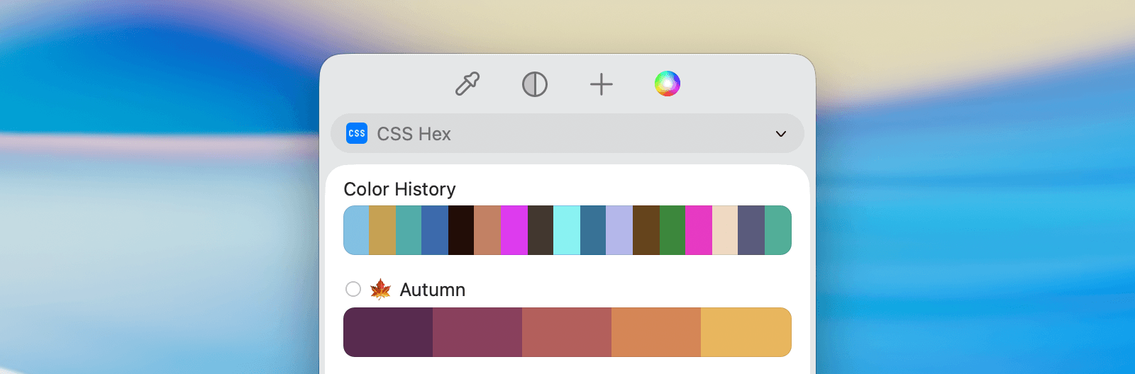
From the Main View
You can also open the Contrast Checker while working with palettes and colors in the main view.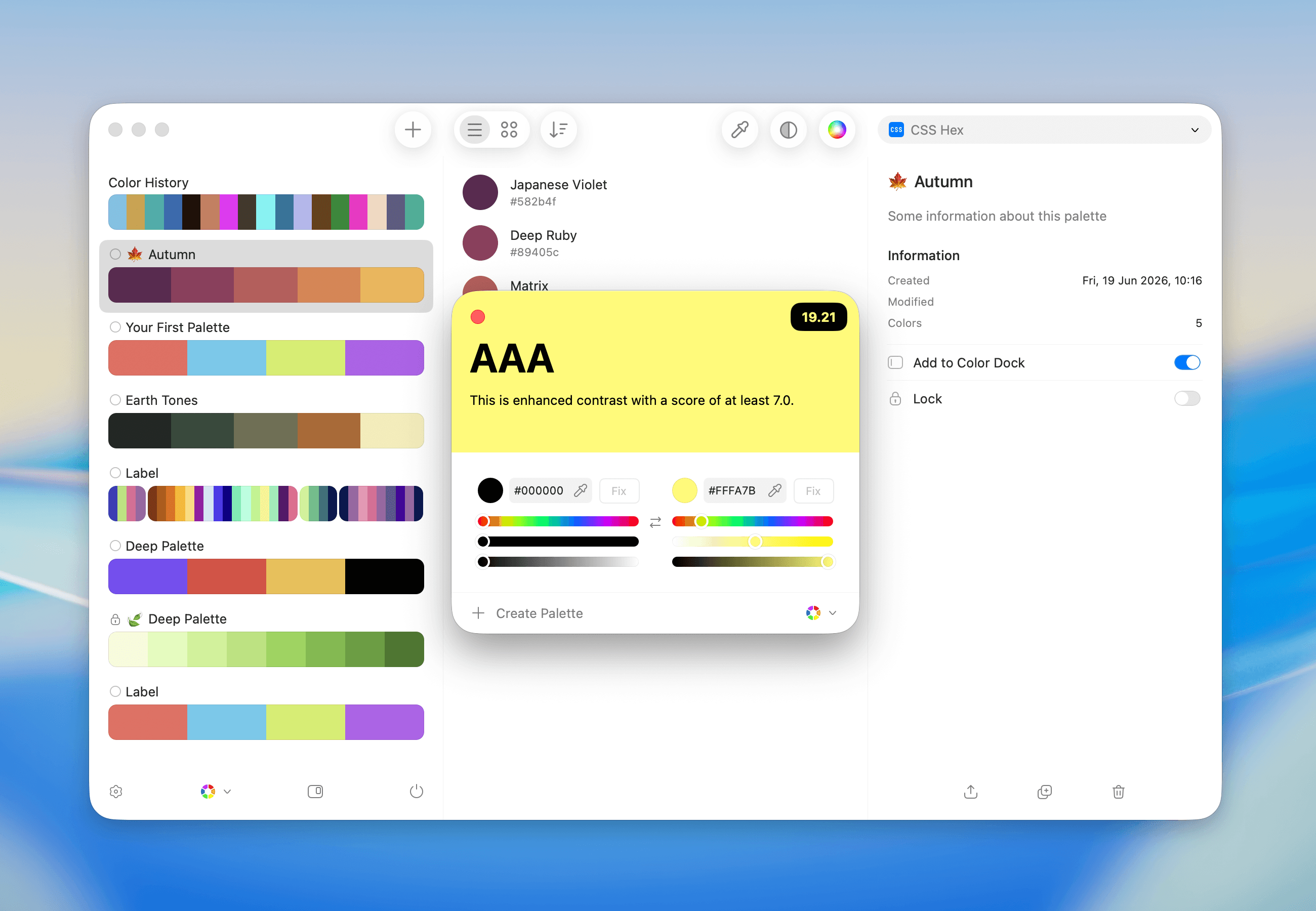
Simulating and Fixing Contrast
Simulating Contrast
The Contrast Checker displays your text and background colors, alongside a contrast score. Adjust colors using the sliders or the color fields. The score updates in real time.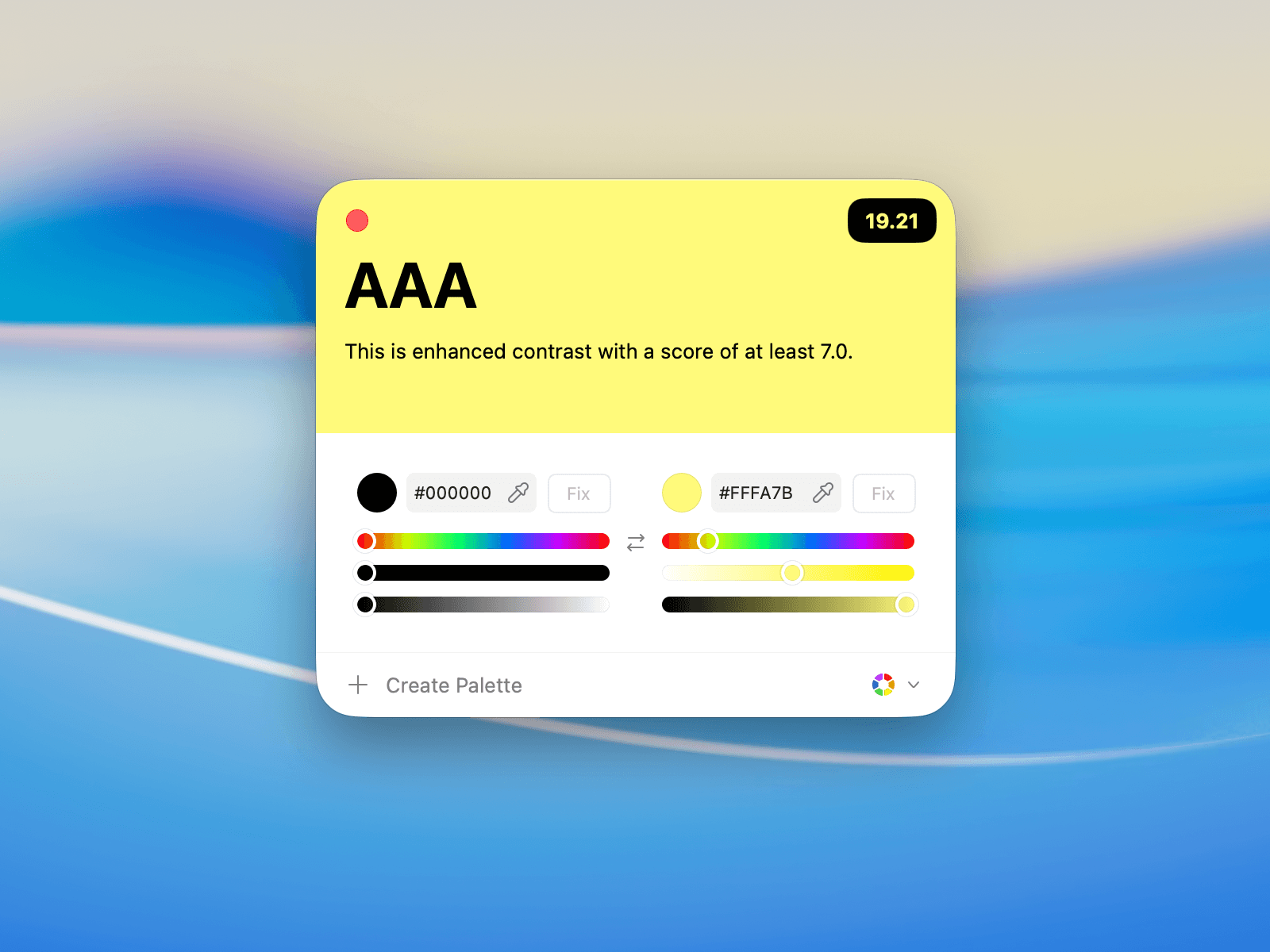
Fixing Contrast Automatically
If a combination doesn’t meet accessibility standards, use the Fix button to automatically adjust the color for better contrast.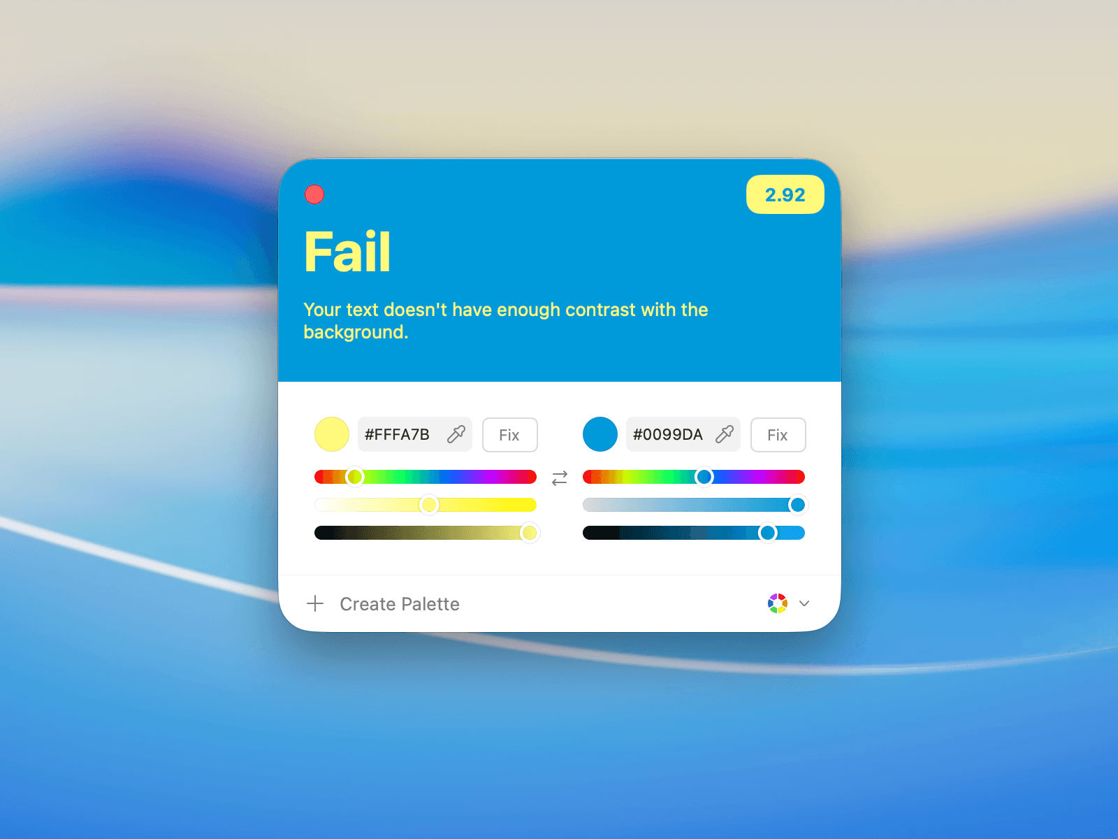
Editing Colors
You can manually adjust text or background colors to fine-tune your contrast.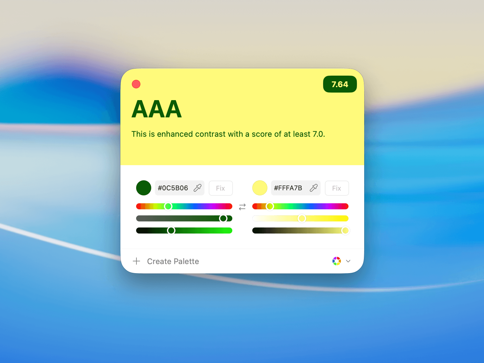
Check Contrast Results
The checker will visually indicate the contrast level:- Fail: Not enough contrast for readability.
- AA: Good contrast for regular text.
- AAA: Excellent contrast, meeting enhanced readability standards.